
Designing Dashboards with Purpose
Designing
Dashboards
with Purpose
Designing Dashboards
with Purpose
Designing Dashboards
with Purpose

My Role
My Role
My Role
My Role
Leading the redesign of the Hashicorp Cloud Platform (HCP) Organization Dashboard from ideation to handoff.
Leading the redesign of the Hashicorp Cloud Platform (HCP) Organization Dashboard from ideation to handoff.
Resources
Resources
Resources
Resources
5 months
1 Product Designer (me)
1 Product Manager
5 months
1 Product Designer (me)
1 Product Manager
5 months
1 Product Designer (me)
1 Product Manager
I have participated in the creation of every design and artifact shown
I have participated in the creation of every design and artifact shown
I have participated in the creation of every design and artifact shown
Project Details
What is Hashicorp Cloud Platform (HCP)?
What is Hashicorp Cloud Platform (HCP)?
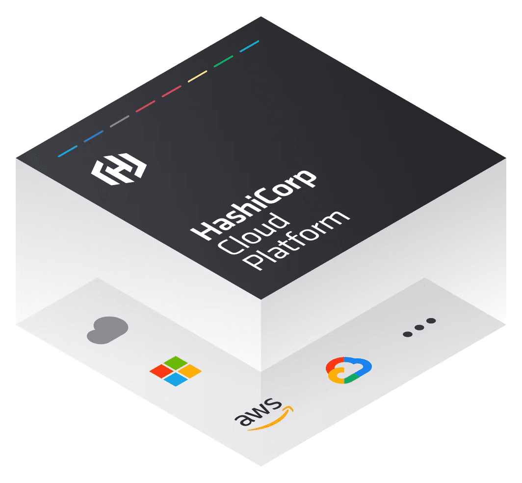
HCP is a managed cloud platform that lets teams use tools like Terraform, Vault, and Consul without managing the infrastructure themselves. It offers a single UI for provisioning, securing, and monitoring services, with built-in access controls and a clear org-project hierarchy.
Terraform is the #1 configuration management tool with more than 32% market share. It is a tool that helps you set up and manage computer systems and resources in the cloud automatically.
HCP is a managed cloud platform that lets teams use tools like Terraform, Vault, and Consul without managing the infrastructure themselves. It offers a single UI for provisioning, securing, and monitoring services, with built-in access controls and a clear org-project hierarchy.
The Objective
The Objective
Redesign HCP Org dashboard to reduce friction, clarify navigation, and surface role-relevant actions grounded in Jobs To Be Done and real user workflows.
Redesign HCP Org dashboard to reduce friction, clarify navigation, and surface role-relevant actions grounded in Jobs To Be Done and real user workflows.
Redesign HCP Org dashboard to reduce friction, clarify navigation, and surface role-relevant actions grounded in Jobs To Be Done and real user workflows.
Results
Results
Improved clarity, added smart alerts and quick actions, reducing key role-based workflows from 3+ clicks to 1 while providing a more scalable, role-aware foundation.
Improved clarity, added smart alerts and quick actions, reducing key role-based workflows from 3+ clicks to 1 while providing a more scalable, role-aware foundation.
Improved clarity, added smart alerts and quick actions, reducing key role-based workflows from 3+ clicks to 1 while providing a more scalable, role-aware foundation.
Who are we impacting?
Who are we impacting?
4,423 Companies are active users of HCP (as of 2024), including companies like:
29,259 Companies are active users of Terraform, including companies like:
29,259 Companies are active users of Terraform, including companies like:



Old Dashboard
Old Dashboard
Old Dashboard
New Dashboard
New Dashboard
New Dashboard


So… Why change it?
So… Why change it?
So… Why change it?
It wasn't aesthetic. HCP dashboards needed a redesign to reduce navigation friction, surface the most relevant information, and transform them from static landing pages into decision-making tools for engineering teams.
It wasn't aesthetic. HCP dashboards needed a redesign to reduce navigation friction, surface the most relevant information, and transform them from static landing pages into decision-making tools for engineering teams.
Solution
Solution
I redesigned the HCP dashboards into a role-aware, personalized workspace that prioritized the right information at the right time, helping users move from exploration to confident day-to-day operations.
I redesigned the HCP dashboards into a role-aware, personalized workspace that prioritized the right information at the right time, helping users move from exploration to confident day-to-day operations.
Solution
But how did I get here? … ↓
But how did I get here? … ↓
Research
To understand user needs, I conducted competitive analysis, support and customer interviews, persona development, and Jobs-to-Be-Done (JTBD) mapping to uncover pain points and guide design decisions.
Defined the goals, behaviors, and needs of Platform Engineers and Application Developers to ensure the dashboard supported both user groups.

Personas
To understand user needs, I conducted competitive analysis, support and customer interviews, persona development, and Jobs-to-Be-Done (JTBD) mapping to uncover pain points and guide design decisions.
Personas
Personas
Defined the goals, behaviors, and needs of Platform Engineers and Application Developers to ensure the dashboard supported both user groups.
Competitive Analysis
Competitive Analysis
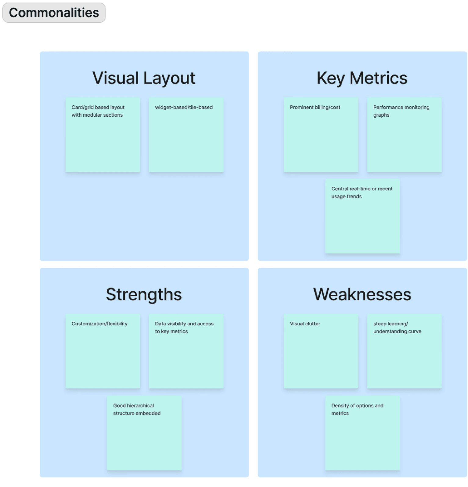
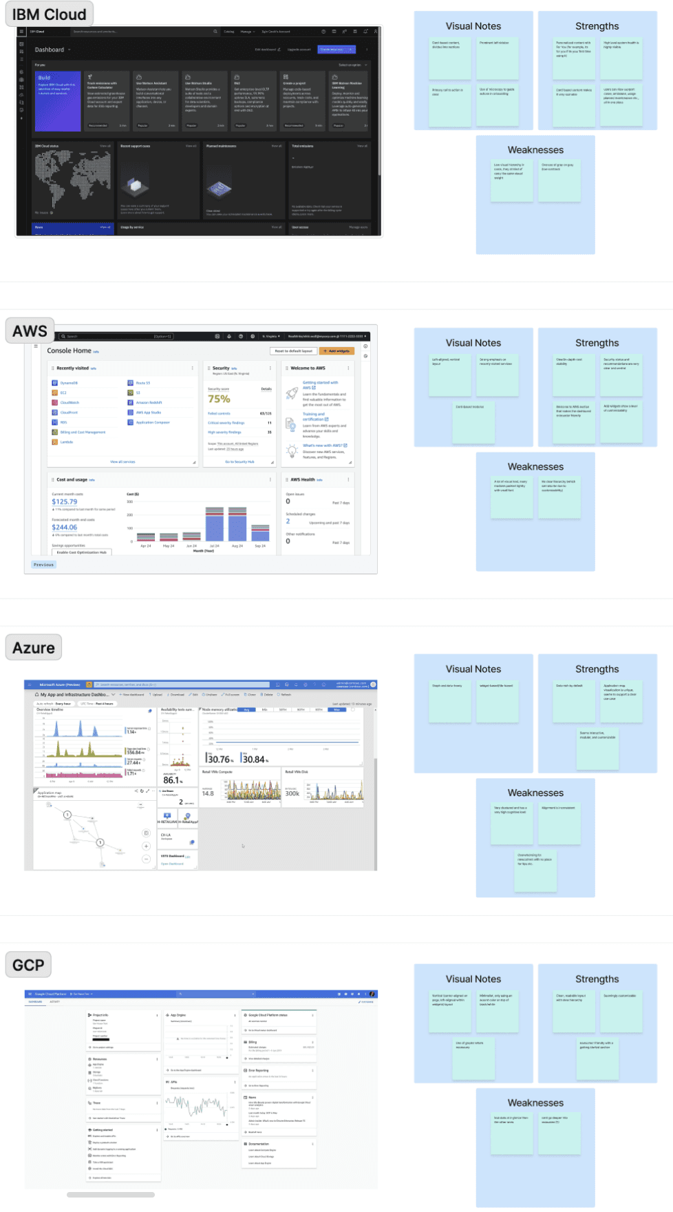
Analyzed cloud platforms such as IBM, AWS, Azure, and GCP to understand industry patterns, user expectations, and best practices.
Analyzed cloud platforms such as IBM, AWS, Azure, and GCP to understand industry patterns, user expectations, and best practices.
Competitive Analysis
Support Call Insights
Support Call Insights
Support Call Insights
Support Call Insights
Spoke with customer support to identify recurring user issues, common questions, and operational pain points.
Spoke with customer support to identify recurring user issues, common questions, and operational pain points.
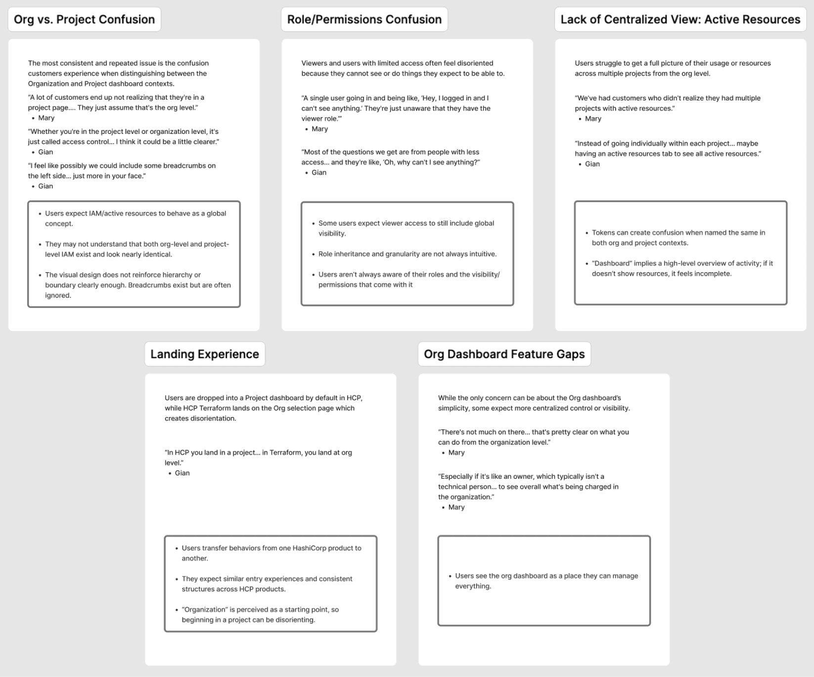
The visual design does not reinforce the difference between project and org dashboards clearly enough.
The visual design does not reinforce the difference between project and org dashboards clearly enough.
“Dashboard” implies high-level overview of activity, not showing resources makes it feel incomplete.
“Dashboard” implies high-level overview of activity, not showing resources makes it feel incomplete.
Users see the org dashboard as a place they can manage everything.
Users see the org dashboard as a place they can manage everything.
Customer Call Insights
Customer Call Insights
Gathered direct feedback from HCP users to understand real workflows, frustrations, and feature requests that informed the redesign.
Gathered direct feedback from HCP users to understand real workflows, frustrations, and feature requests that informed the redesign.
Key Metrics on Landing = High Priority
Key Metrics on Landing = High Priority
Deployment health, failed Sentinel policies, Terraform versions, security risks, high-level usage
Deployment health, failed Sentinel policies, Terraform versions, security risks, high-level usage
Alerts + Status Must Be Actionable and Trustworthy
Alerts + Status Must Be Actionable and Trustworthy
"Isolated customer zones map well to our stacks, but as ever, the problem of dependencies across stacks is sticky!"
"Isolated customer zones map well to our stacks, but as ever, the problem of dependencies across stacks is sticky!"
Need for Customization by Persona or User
Need for Customization by Persona or User
"Isolated customer zones map well to our stacks, but as ever, the problem of dependencies across stacks is sticky!"
"Isolated customer zones map well to our stacks, but as ever, the problem of dependencies across stacks is sticky!"
Too Much Clutter / Irrelevant Information
Too Much Clutter / Irrelevant Information
"Isolated customer zones map well to our stacks, but as ever, the problem of dependencies across stacks is sticky!"
"Isolated customer zones map well to our stacks, but as ever, the problem of dependencies across stacks is sticky!"
Customer Call Insights
Jobs to be Done (JTBD)
Jobs to be Done (JTBD)
Mapped users' key objectives and workflows to keep every design decision focused on helping them complete important tasks more efficiently.
Mapped users' key objectives and workflows to keep every design decision focused on helping them complete important tasks more efficiently.

Jobs to be Done (JTBD)
Design
During my design process, I mapped how user needs evolve from onboarding to daily operations, allowing the dashboard to adapt as users become more experienced.
During my design process, I mapped how user needs evolve from onboarding to daily operations, allowing the dashboard to adapt as users become more experienced.

Focused on reducing uncertainty by helping first-time users understand where they are, what they can do, and what to do next.
Focused on reducing uncertainty by helping first-time users understand where they are, what they can do, and what to do next.

Shifted the experience from learning the platform to accomplishing tasks by prioritizing relevant information and supporting users' growing mental models.
Shifted the experience from learning the platform to accomplishing tasks by prioritizing relevant information and supporting users' growing mental models.

Reimagined the dashboard as a workspace that adapts to experienced users, emphasizing quick situational awareness and efficient decision-making over exploration.
Reimagined the dashboard as a workspace that adapts to experienced users, emphasizing quick situational awareness and efficient decision-making over exploration.

One insight became clear throughout the project: there isn't a single "HCP user." Platform Engineers and Application Developers have different goals, responsibilities, and permissions. Instead of designing one experience for everyone, I explored how the dashboard could adapt to who the user is and what they're trying to accomplish.
One insight became clear throughout the project: there isn't a single "HCP user." Platform Engineers and Application Developers have different goals, responsibilities, and permissions. Instead of designing one experience for everyone, I explored how the dashboard could adapt to who the user is and what they're trying to accomplish.
Design Iterations
For immediate deployment, I had to simplify.
For immediate deployment, I had to simplify.

Rather than adding more information, I focused on making the existing experience easier to understand by using already existing backend work. By simplifying the hierarchy, clarifying navigation, and emphasizing what mattered most, the dashboard became easier to scan, learn, and use with confidence.
Rather than adding more information, I focused on making the existing experience easier to understand by using already existing backend work. By simplifying the hierarchy, clarifying navigation, and emphasizing what mattered most, the dashboard became easier to scan, learn, and use with confidence.
The End!
Key Learnings & Takeaways
Key Learnings & Takeaways
Key Learnings & Takeaways
Key Learnings & Takeaways
Complexity should be managed, not hidden.
Enterprise products can't always be simplified, but they can present complexity in a way that feels intuitive.
Complexity should be managed, not hidden.
Enterprise products can't always be simplified, but they can present complexity in a way that feels intuitive.
Complexity should be managed, not hidden.
Enterprise products can't always be simplified, but they can present complexity in a way that feels intuitive.
Research should drive prioritization.
User feedback helped determine not only what to design, but what was most valuable to ship first.
Research should drive prioritization.
User feedback helped determine not only what to design, but what was most valuable to ship first.
Research should drive prioritization.
User feedback helped determine not only what to design, but what was most valuable to ship first.
Design is about tradeoffs.
Balancing user needs, technical constraints, and product vision was just as important as crafting the interface.
Design is about tradeoffs.
Balancing user needs, technical constraints, and product vision was just as important as crafting the interface.
Design is about tradeoffs.
Balancing user needs, technical constraints, and product vision was just as important as crafting the interface.